Images contextualize content and improve the user experience, making them essential for an effective SEO strategy. While there are many aspects of image optimization, today we’re focusing specifically on how to use images to better your website UX.
Fun Fact: WordPress touts 70 million new posts are published each month on their platform alone. Yep, that’s a lot of content for Google to sift through, evaluate and rank. Images also help content stand out, which is another reason why THIS is the year you will create the perfect image strategy.
How Images Improve User Experience
1. When Contextually Relevant
If the goal is to improve the user experience with images, the most important factor is that they’re contextually relevant to the content on the page. It would make no sense to the user to have images of house plants on a DIY shower scrub article. Make sure the images you add to the page help the user accomplish something, whether that is to better understand the process, the product or information.
And even when the images are contextually relevant, it doesn’t help the user if there are too many. Not only could that have page speed implications, the user could tire of scrolling through endless similar pictures. Find the balance of helpful to the user and exactly the right amount.
2. When Responsive
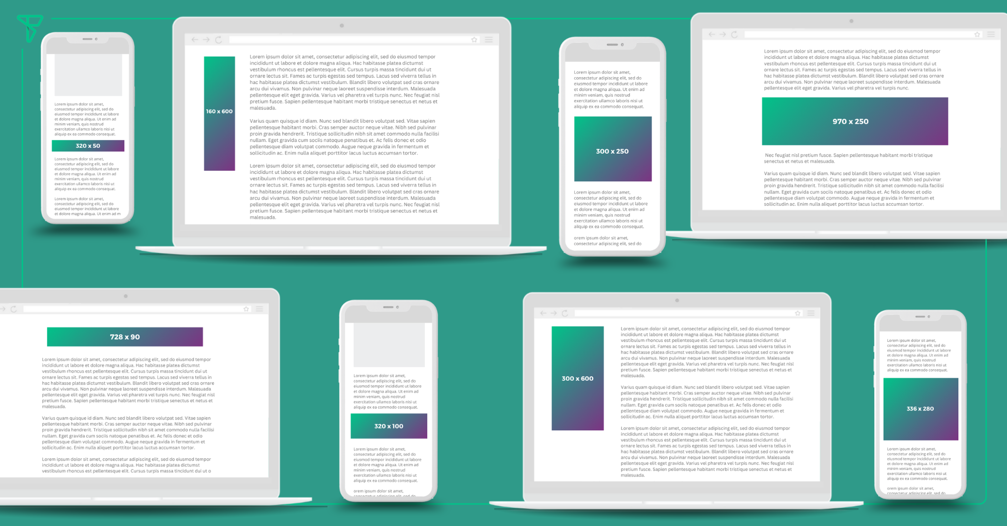
Viewing a non-responsive image from your phone can cause a frustrating experience. Website images should smoothly scale with the size of the site, whether desktop, tablet or mobile. In order to do this, you must use the srcset and sizes attributes to give the browser additional source images, which will allow identical image content to be resizes.
Technical details beyond that should be left to the expertise of a developer, a plugin or this comprehensive guide might help. But do check your site on mobile to make sure there are no heads cut off or awkwardly enlarged visuals.
3. Enhanced Search Results
Images can enhance how your site looks in search results, and that creates a better user experience before the user ever hits your page. With the proper structured data, just on Google alone, images are shown in mobile carousals, recipe packs, regular search results, product results, image results and Google Discover. That’s a lot of opportunity for additional traffic.
4. When They Help Explain a Process
Process Shots can make or break the user experience. For DIY and how-to queries, landing on a text-heavy page without images can be anything but helpful. However, if you include step-by-step instructions, with an accompanying image to show the reader, that goes a long way.
Remember not to overdo it either though. If there are 15 steps listed on the page, 15 images may slow it down considerably. Use images when they show something new or just the more challenging of the instructions.
5. When It’s Information Displayed Visually
Infographics are an excellent way to engage the reader even more than the average image. Because this style image typically includes some sort of data or information, the user tends to stop, scroll and spend time digesting.
They can also be a great way to get backlinks and coverage from other publications.
6. For Products and Recipes
Webpages promoting products or recipes require an even deeper level of image strategy. With products, it’s tough because in many cases, the writer may not have the product to get a unique shot. Product images available from manufacturers or sellers are often the same as hundreds of others. But product images aren’t one you can typically skimp on.
For recipes on the other hand, getting the perfect food photo can become an obsession. Classes and courses are dedicated to food photography tips. When recipes themselves aren’t original, providing the best image can put you ahead of the rest.
7. When They’re Interesting
Last on the list may be the most challenging of all, you need to make them unique, interesting and eye-catching. Back to the 70 million new blog posts published each month, how is it even possible to have that many different images to supply content with?!!
In truth, it really depends the niche. Many demand custom images, like recipe sites, DIY content or travel. For the informational sites, like this one for example, the challenge becomes avoiding the overtly stocky photos (computer man hands, girl smiling at a conference, you know the ones). Using tools like Canva or Unsplash to pull photos that you then modify slightly through filters or treatments, might be the easiest solution to custom-like photos.


