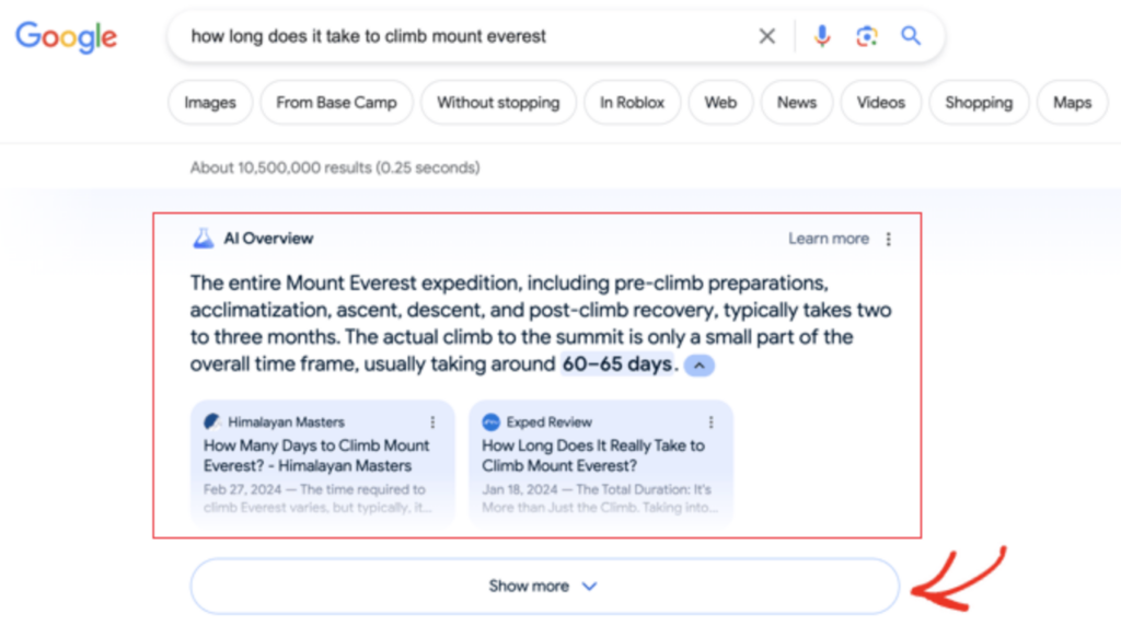
You may have noticed a new addition to the Google search result pages launch earlier this month, it was pretty hard not to. With many search queries, AI-generated answers now auto-populate at the top of the results. This answer is compiled from a mixture of large language models and content from around the web that is available to them via the indexing of websites, like yours.

Google will “do the searching for you” by crawling whichever set of trusted websites previously would have been at the top, and then generates an answer in a comprehensive and digestible manner. Since publishing content makes you a publisher, this makes Google’s AI Overviews (formerly Search Generative Experience) your newest competitor.
Although there is a possible glimmer of hope coming for HCU recovery if you’ve put in the work, publishers have largely continued to face traffic decline over the last 10 months. And now this.
At Freestar, we’re built on the notion that the website is the main event, the most valuable real estate. For years, as attention increased for Facebook and Instagram, we held strong that investment was better suited for websites. We’re adtech, yes. But without traffic to websites, what will there be to monetize? The same advice to invest in the website is true today, and we believe there’s a positive future for publishers who’ve built sustainable businesses with clear user value.
How To Compete With AI Overviews
Start With a Clean UX
It’s important that an immediate feeling of ease is conveyed from your website. You’ll notice AI Overviews don’t have a newsletter pop ups, ads, or video players blocking content. The background color isn’t black, music isn’t playing. It’s a clean, uncluttered, simple experience.
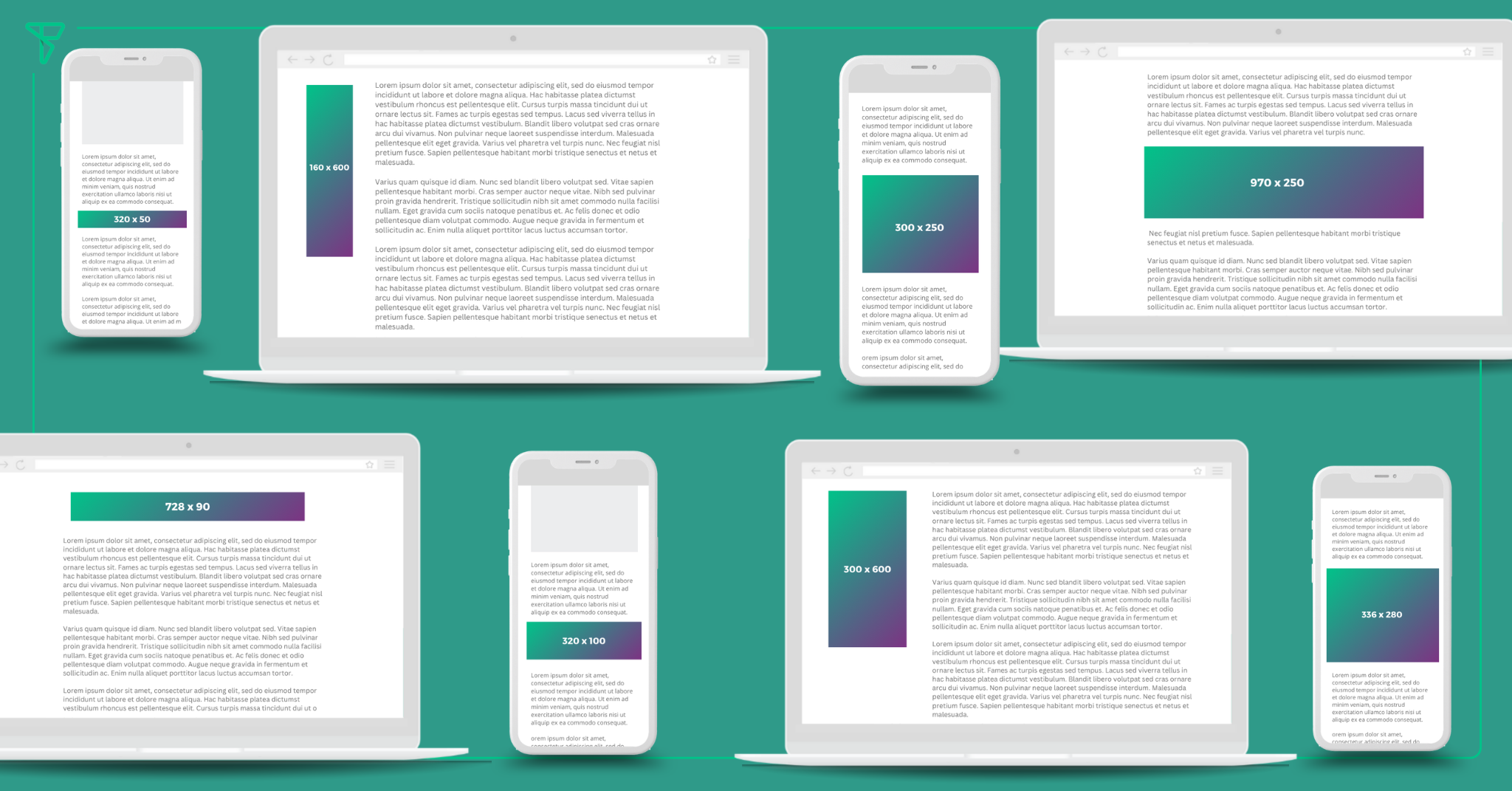
Images should enhance, not distract, from the content on the page as they draw users in farther. They should be responsive and sharp. Move away from stock images and invest the time and effort into creating images that are helpful to the reader. For utility sites, buttons tend to be larger with rounded corners for a more modern feel.
AI Overviews reflect modern design trends because Google has data to support a reader’s preference in these areas. We frequently tell publishers to increase the font size of their text to at least 16-18 pixels. Lines of text should be well padded, with line breaks every 3 to 4 sentences. Choose clear typography and use black as the color. These techniques make it easier for people to read.
Easy To Find, Easy To Read
The best part about AI Overviews is the ease and clarity in which they serve up the answer. Accuracy of information may be another thing, but the confident and simply stated responses save time. In theory, if the idea of AI-generated answers was to scan all the top web pages, cross-check, fact-check, and then combine to spit me out an even better answer than these websites could provide, that would be a great benefit. So far, these answers seem to function more like structured data, just pulling content straight off of a website and into the SERP. In many cases, the website it’s pulling from isn’t even from the top 10!
Search engine optimization is rooted around making websites and content discoverable to Google and users. For the last decade, advice to publishers has been to have seamless navigation, clear and concise writing and organized articles.
1. Keep the most important information close to the top. Users click into your article expecting to find what they’re looking for so don’t make them dig for it. In the last few years, it’s become common to see summary bullets at the top of posts. Readers love a good TLDR;.
2. For more in-depth articles, use heading tags (h2-h4) to clearly identify content within sub-sections of the post. Google introduced a SERP feature in 2020 called passage ranking. This system helped Google pull out deeper paragraphs and expose them in the results, and could have been the foundation for their hidden gems update in 2023. Organize content in a way that’s easy for users to understand.
3. Having accessible and clear website navigation keeps users on the site without leaving them frustrated. Front-end breadcrumb navigation on articles is a surprisingly easy way to keep users from feeling lost.


