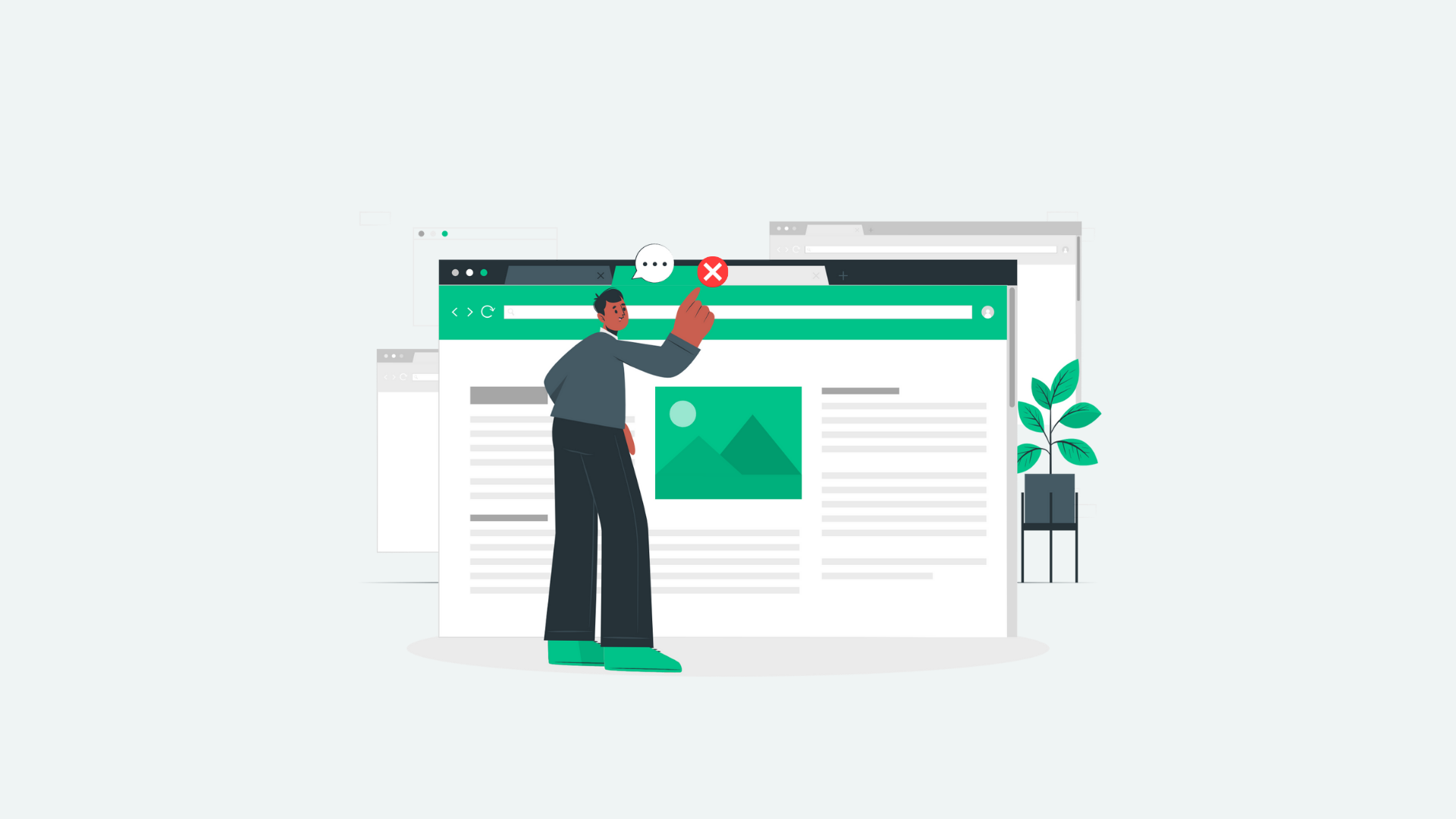
Bounce rate refers to the percentage of people who view one page and then leave the website. A single-page session.
By being able to recognize, diagnose and implement improvements for high bounce rate pages, you’ll see engagement metrics for your site increase. A high bounce rate can indicate poor user experience, slow load times, or low-quality content. But the good news is that most of our bounce rate optimization tactics can be done without the need of a developer!
Before we jump into that, here are a few interesting things I’ve learned about publisher’s bounce rates:
– If it’s abnormally low, certainly anything under 10%, it’s a sign something is broken.
– A more normal range for publishers is 50-70%.
– Certain pages, particularly ones that answer one-word queries, will have higher bounce rates and that’s ok. The user may have found exactly what they were looking for and then, left. In cases like this, get creative with internal links and create new related content that would lead a user to another page of your site.
– The most common reason a user leaves a site after viewing just one page is either they couldn’t or didn’t find what they were looking for, the site was too slow or the content wasn’t interesting enough to keep their interest.
How to Lower Bounce Rate
Each month, we work with Freestar publishers on growing their audience. And in order to consistently grow audience, it’s important to make sure the user experience on your site is perfect in every way.
1. Conduct thorough keyword research
The number one reason someone bounces from your site is that they didn’t find what they were looking for. Make your goal to cover the topic of your headline so thoroughly that the user doesn’t need to go anywhere else for additional information. Writing a top-ranked web page for a high-volume search term isn’t easy. Get your hands dirty, put in the work to fully understand sub-topics within the main headline topic.
– Use keyword research tools like Answer the Public, Topic Research by SEM Rush, KeySearch.co or Glimpse.
– Before you hit publish, look at the content that is currently ranked in the top spots of Google. They must be doing something right, so look for commonalities. For example, do they all include video on the page? If so, you can assume video is something users find valuable.
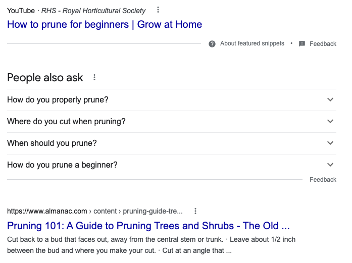
– Search the topic in Google and scroll down to the ‘People Also Ask’ section. Incorporate these questions/answers into your posts in a natural way. Little known fact, if you click the 4th question dropdown (as shown in the screenshot below), more questions continue to drop down. People tend to think there are only four.
Posts need to be structured in an organized and clear way. Mobile users tend to scroll vertically to find exactly the information needed. Your post headline should include the main topic or key-phrase. There should be an introductory paragraph that also mentions the main topic, along with what the articles entails within.
There should be images, video, social embeds to keep the reader engaged. The other important piece is heading tags. Break the content up in sub-topics with the h2 or h3 heading tags (either one, Google reads them both as *other important parts).
3. Website design should be appealing, modern and interesting
How your site looks to users will be one of the first impressions your brand makes. Updating the aesthetics every few years can keep things interesting, fresh and aligned with new competition on the scene.
I’ve now been at Freestar just over two months, working with publishers on traffic growth. Some of the sites I’ve already had the pleasure of working with have crazy low bounce rates (30-40%), and I’ve realized that a similarly between them is an offering outside of content. Many sites offer tools, generators, games, forums, in addition to helpful content.
4. Page layout should be optimized for mobile
Optimizing a site for mobile isn’t just about being responsive based on device type. Other things that make a website more mobile friendly are larger font sizes, responsive images, clear font type and heavily styled hyperlinks.
Long blocks of text have been traded in for 1-2 sentence paragraphs with extra padding between the lines. The better the readability, the longer a user with engage with the page.
5. Don’t assault the user with aggressive pop up boxes, sign up CTAs or auto-sound
Just because Freestar offers best-in-class website and app monetization capabilities, it doesn’t mean we forego the importance of user experience. You’ll never find that we put revenue before users, that’s not a long-term plan we support.
Instead, choose wisely when it comes to what you expose the reader to. Internally, implement a performance budget. This means taking a look at all business stakeholders and what space their initiatives take up on the site. Examples are the content (stakeholder: editorial team), ads (stakeholder: revenue dept.), product placements (stakeholder: sales) and video unit (stakeholder: video team). All these placements impact the user experience so it’s best to prioritize.
6. Monitor broken links
When users land on broken links, they tend to leave. Monitor your broken pages with tools like Google Search Console, Screaming Frog or SEM Rush and fix them when you can.
Also, customize your 404 landing page to include a thoughtful message, and some new links to get the user back on the right path. If interesting enough, you can still save the user from a bad experience despite the fact they landed on a dead page.
7. Include internal links to relevant content
Having a smooth navigation from one page to the next encourages a user to continue on.
“Through working with some of the biggest publishers in the past five years, I’ve learned that understanding the user persona is important to reduce bounce rate. The one-size-fits-all approach no longer works, so we’ve explored personalized content distribution strategies.
Also, perpetual scroll and non-intrusive content suggestions have engaged readers even further, and that has helped.”.
Ashish Garg
8. Display trust signals
Users want to be able to trust the content they consume, and there are ways to help them do that. People tend to be more questioning of content that doesn’t have a date or an author’s name.
For products, rentals and experiences people lean on ratings and reviews. If it makes sense for your site to offer those options, place the results where users can easily spot them.
Websites that don’t often publish new content, or release new products look outdated and possibly no longer in business. Make sure your homepage showcases new messaging, your latest articles and any brand updates. These additions bring signs of life to your site, which can increase the trust of your users.
9. Outbound links should open in a new tab
Links that take a user off your site to another should be used sparingly. As in, only when it’s so important, you’re willing to lose the user. Make sure these links open in a new browser tab, allowing the reader to also remain on your own page.
A high bounce rate presents an opportunity to improve user experience. Aligning your audience with useful and useable content, and a seamless user experience, odds are they’ll at least click around to see other pages on your site.
As we head into Q2, take time to test these bounce rate optimization strategies and we’d love to know which ones made the most improvement to your metrics!