To start, there is no such thing as an “ideal” ad layout. Every website is unique so what may work for one publisher may not work for another. It takes trial and error to find the optimal ad layout and even then, we recommend publishers to continue optimizing.
So, I guess, the right question to ask is “how can a publisher optimize ad layout?” As a publisher, here’s what you can do:
- Prioritize Viewability – It’s important to remember that the higher your viewability is, the higher revenue you can receive. Advertisers value ad placements that have higher viewability. There are a few ways to improve viewability and they are:
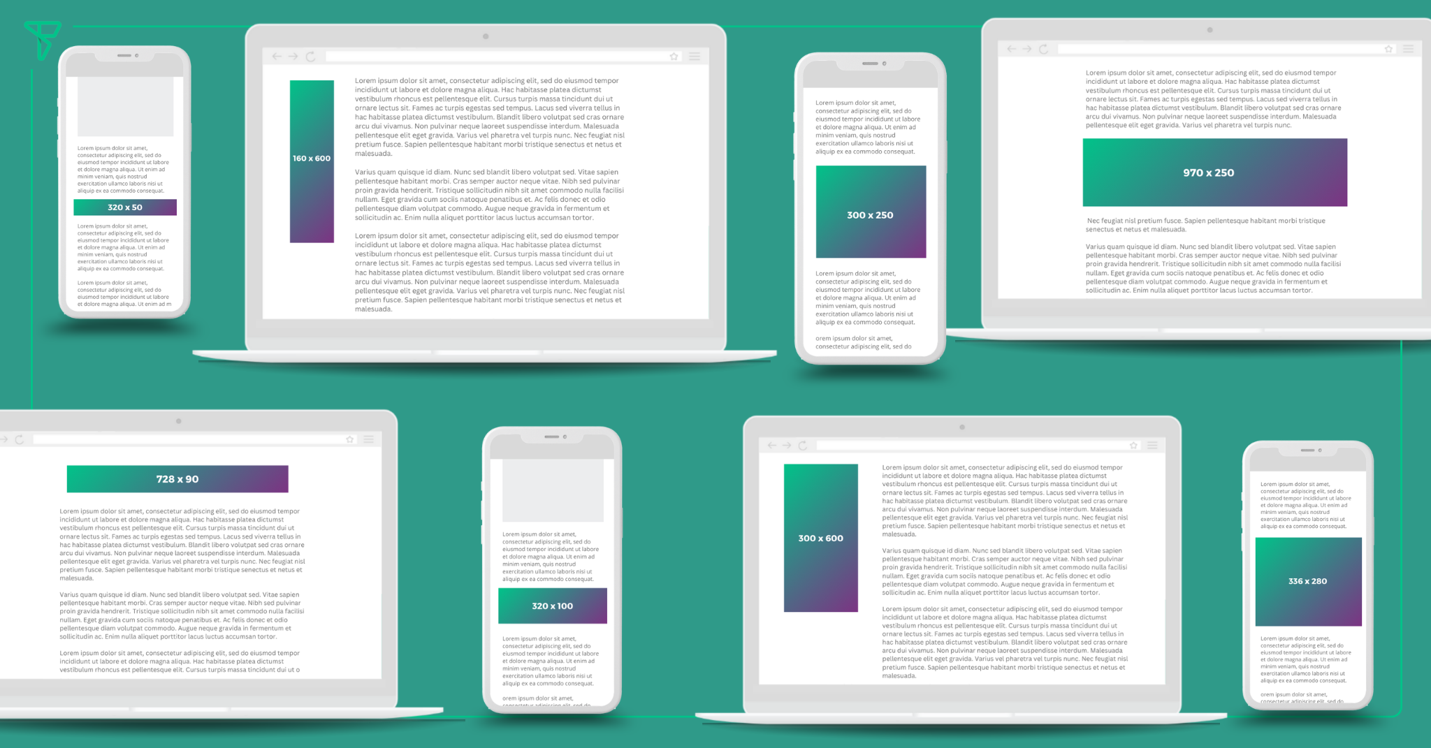
- Ad Placement – It is important to have ads that aren’t too high or too close to the content, and so forth. You want to place your ad where it’s visible near the content but not close enough that it’s impeding the user experience.
- Lazy Loading – With lazy loading, ads that are not likely to be seen are not loaded, resulting in fewer unviewed impressions being served which improves your viewability. Advertisers dislike paying for impressions that users do not see, so the higher your viewability, the more valuable your inventory is.
- Sticky/Anchor Units – Sticky units (like sticky footer, pushdown, and sidewalls) and anchor ads, are great for viewability because they remain 100% visible to users and refresh for the entire time they’re on the page, which translates to incredibly high viewability.
- Be Flexible – Optimizing your ad layout will require you to move elements and make changes to your website. Sometimes change is hard to accept but these changes are to maximize your revenue. For example, if your social media icons are at the bottom of the page and overlapping with a sticky footer, it would be best to move your social media icons to a different location where it won’t interfere with the ad unit.
- Improve Page Speed – Users are more likely to stay on a website that loads quickly and navigate through it easily. A slow-loading page can lead to frustration and can cause users to leave the site before it has fully loaded. This can increase your bounce rate and decrease viewability and engagement metrics.
- Review Cumulative Layout Shift (CLS) – CLS is a measure of how much your content changes position as your page loads. You want to keep your CLS low since a high CLS can cause your users to experience unexpected layout changes and poor user experience. Ads can move important buttons and links down the page just as users are about to click, who then click through to your advertiser’s site, and the advertiser gets charged for it. Rather than a potential customer, advertisers now have someone who associates their brand with your site’s frustrating UX.
[fusion_imageframe aspect_ratio="" custom_aspect_ratio="100" aspect_ratio_position="" lightbox="no" linktarget="_self" align_medium="none" align_small="none" align="none" mask="" custom_mask="" mask_size="" mask_custom_size="" mask_position="" mask_custom_position="" mask_repeat="" style_type="" hover_type="none" margin_medium="" margin_small="" caption_style="off" caption_align_medium="none" caption_align_small="none" caption_align="none" caption_title_tag="2" animation_direction="left" animation_color="" animation_speed="0.3" animation_delay="0" hide_on_mobile="small-visibility,medium-visibility,large-visibility" sticky_display="normal,sticky" filter_hue="0" filter_saturation="100" filter_brightness="100" filter_contrast="100" filter_invert="0" filter_sepia="0" filter_opacity="100" filter_blur="0" filter_hue_hover="0" filter_saturation_hover="100" filter_brightness_hover="100" filter_contrast_hover="100" filter_invert_hover="0" filter_sepia_hover="0" filter_opacity_hover="100" filter_blur_hover="0" image_id="16454|full"]https://freestar.com/wp-content/uploads/2023/03/FAQ-Whats-an-Ideal-Ad-Layout_-Graph-1.png[/fusion_imageframe]
We recommend reaching out to your Customer Success and Yield team to help strategize optimizing your ad layout. These are a few don’ts our team has when it comes to ad layout:
- Land Locking Ads – If you’re unfamiliar with this term, it is when you place an ad unit on the page and it can only be a specific ad size (ex. 300×250). When you land lock a placement, you limit what size creatives can run which hurts demand decreasing fill rate and CPM.
- Overlapping Ads and Content – Ads should not overlap with content on your site. It’s important to have a responsive layout to improve user experience and prevent accidental clicks from occurring. An accidental click can result in that ad placement becoming less valuable.
- Ads at the Top/Bottom of Page – It’s best practice to limit using ads on the top and bottom of a page. What usually occurs is that the user is already scrolling before the ad finishes loading. As a result, you’re not getting the viewability you want for that ad placement.
Like we said early, the answer to this question is that there’s no “ideal” ad layout. You’re better off optimizing your existing ad layout by prioritizing viewability, being flexible, improving page speed and reviewing CLS.
If you’re interested in learning what Freestar can do for you, you can get started today by completing this form.


